


Business of Welding: Welder performance - Examining the fine points
In my last column, we looked at how to rank your welders in terms of both inches of weld produced and the true cost of their welds per inch after factoring all the costs of welds that failed inspection and had to be redone.
This month we look at how to identify the finer details of welder performance. In this example we have tracked a team of three welders and their daily total weld production over 31 days. We will ignore defective welds for this exercise. For statistical analysis to be valid, you usually want a minimum of 30 data points.
Many companies already track various aspects of their production and use charts and graphs to capture this information. Where some shortfalls occur is if only part of the statistical analysis is used. To do statistical analysis properly is at least a two-step process.
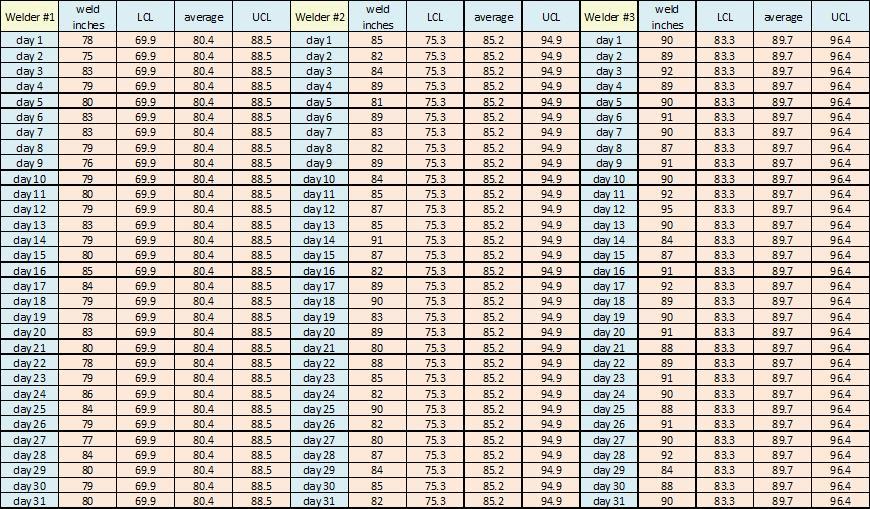
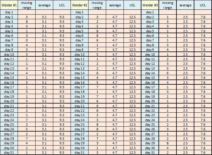
The first step is to develop a spreadsheet that tracks the three welders in question. From this daily production of weld inches we can calculate the welders’ average weld inches over the time period, and the upper control limits (UCL) and lower control limits (LCL) for the graph using three standard deviations. Figure 1 shows a sample of the 31-day chart.
Figure 1: This chart sets out the daily weld production of each welder. The spreadsheet then automatically calculates the upper and lower control limits of the data for each welder’s graph.
We then graph the data for each welder so that we can get a visual representation of what is happening over the entire 31 days’ worth of their daily production. Each welder’s graph will also show the average production for the time period and the upper and lower control limits of the data.
When looking at the graphs in Figures 2 to 4, consider these typical statistical factors:
- Any group of five points in a row above the average are considered to be out of control.
- Any group of five points in a row below the average are considered to be out of control.
- Any point outside the upper or lower control limits is considered to be out of control.
- Any 5 points trending up or down in a row are considered to be out of control.
This is a very basic statistical analysis but it serves our purposes in this example.
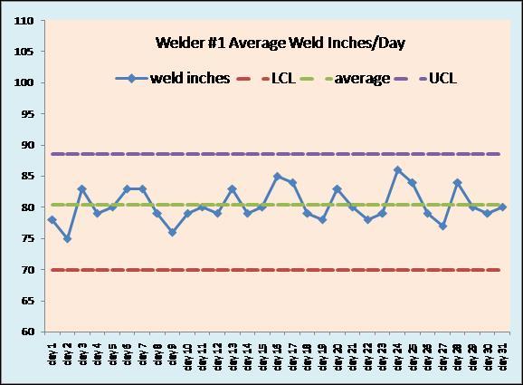
Figure 2
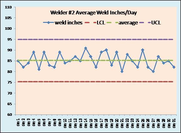
Figure 3
Figure 4
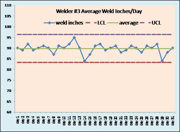
Figures 2, 3, and 4: Each welder’s daily weld production is graphed.
The daily production graphs of the three welders tell us the following:
- Welder 1 is the slowest producer but has the lowest variability in daily production over the 31-day period.
- Welder 1 is the most consistent welder in terms of laying down weld metal day after day.
- Welder 1 may simply be having more problems preparing the joints or cleaning the metal to be welded.
- Welder 1 may have older equipment with a welding machine duty rating less than that of the others, which limits daily operating time.
- Welder 2 is faster than welder 1 but has more day-to-day variability in the amount of weld metal laid down.
- Welder 2 may be having a hard time keeping his mind on his tasks or may simply be taking longer coffee breaks from day to day.
- Welder 2 may be getting jobs that vary in difficulty from one day to the next.
- Welder 3 has the highest daily production.
- Welder 3 has the lowest day-to-day variability.
- Welder 3 has two days that come close to being out of control but do not dip below the LCL so everything appears good. This may be a random “off” day for him.
These three graphs do not really raise any concerns. This is where most companies stop their digging. But we will go to the next level of statistical process control. This is called the moving range.
In the moving range we subtract the day’s value from the previous day’s value. We then end up with one less data point, so 30 instead of the original 31 points. But now we start to see different concerns. Figure 5 offers a sample of this raw data.
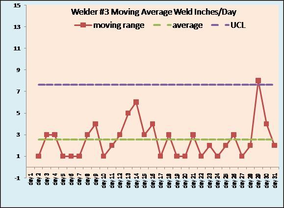
In the graphs of the moving ranges of each welder (Figures 6, 7, and 8), more becomes clear. Once again we see that welder 1 has lower variability than welder 2. Welder 2 has the highest day-to-day variability, but if we can figure out why this is we will improve the production from him or her. Is it mechanical? Is it different welding rods from a different storage oven? Are the welder helpers changing?
We can also see some major issues with welder 3.
Figure 5: A sample of the moving range charts of the three welders.
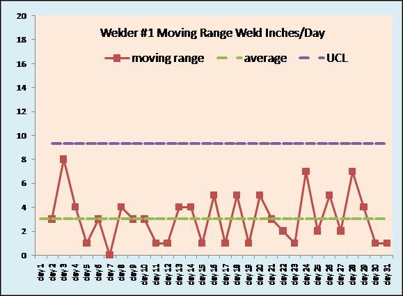
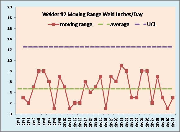
Figures 6, 7, and 8. Moving range graphs for each welder.
The moving range graphs give us a few issues to consider:
- Welder 1 is slow but steady. Variability is less than welder 2 but greater than welder 3. Figuring out what is slowing welder 1 down every day could increase productivity. But sometimes no matter what you do, some people just work slower.
- Welder 2 is middle of the pack in terms of speed but seems to have trouble maintaining the same production every day. He has some sets of days when he almost meets the criteria for being out of control but not quite. He has sets of four days that come close to meeting the criteria, but close is not good enough in statistical process control. Something is affecting his ability to be consistent, and this needs to be examined.
- Welder 3 is out of control. He has a set of five days that are trending up and also a point that is above the UCL. He appears to have two cyclical problems every month. This could be related to payday problems, family problems, or possibly other personal issues. However, it may also be related to who the welder helpers are at these times. Welder 3 is the highest-producing welder with the lowest day-to-day production variability, but he has issues that need to be addressed.
Using statistical process control charts and graphs is a great way to track your production, but do not stop partway. The moving range calculations are an absolute must-do to get the real value of basic number crunching.
Welder costs can make or break a company's bottom line. Remember that being busy translates into making money.
We track our household bills and payments. We track our vehicle maintenance and insurance costs. We track our medical needs. It only makes sense that we do whatever it takes to understand all the things that impact our ability to pay the business’s bills.
There are good welders and bad welders. There are slow welders and fast welders. There are consistent welders and haphazard welders. We need to be able to identify them all, help them improve to help the business, and keep track of everything that can affect their performance every day.
Orest Protch facilitates seminars in basic welding and machining metallurgy for apprentice & journeymen welders, machinists, fabricators & engineers across Canada. He can be reached at oprotch@hotmail.com.
subscribe now


Keep up to date with the latest news, events, and technology for all things metal from our pair of monthly magazines written specifically for Canadian manufacturers!
Start Your Free SubscriptionAbout the Author
About the Publication

- Stay connected from anywhere

Easily access valuable industry resources now with full access to the digital edition of Canadian Metalworking.

Easily access valuable industry resources now with full access to the digital edition of Canadian Fabricating & Welding.
- Trending Articles
1
BlueForge Alliance partners with Nuts, Bolts & Thingamajigs to develop Submarine Manufacturing Camps

2
Portable system becomes hot tech in heat treatment

3
Orbital tube welding webinar to be held April 23

4
Cidan Machinery Metal Expo 2024 to be held in Georgia May 1-2

5
Corrosion-inhibiting coating can be peeled off after use